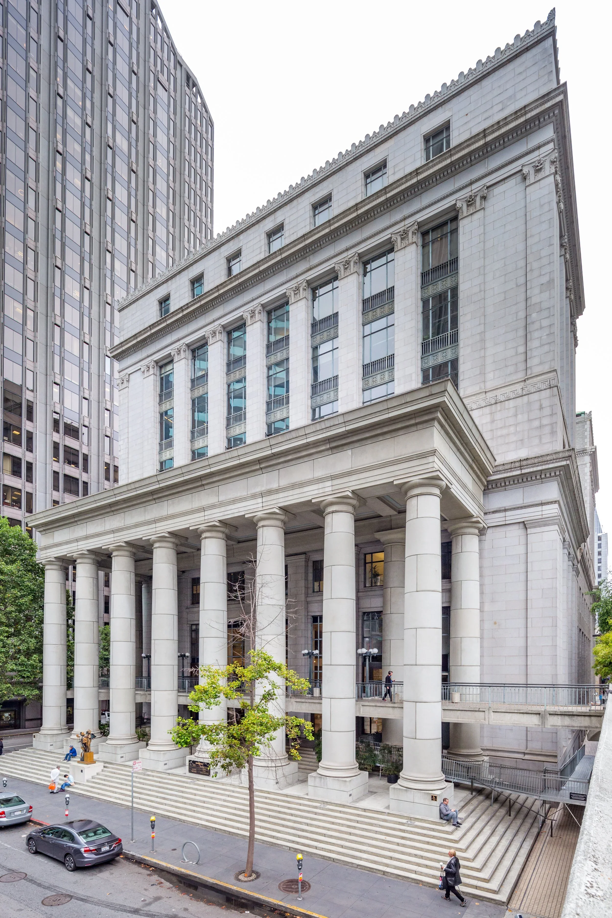
Event Concepts & Graphics
Making a complex space navigable and conducive to learning — the same translation problem, in three dimensions.
Spigit (now Planview IdeaPlace)
Concept, art direction, graphic design, signage, stage design
Contractor
Technical input
Spigit held an annual conference for 500 people to which it invited its partners from government, financial, and technical sectors. The design of the event should inspire learning, facilitate meaningful networking, and deepen business relationships — all while working with a minimal budget.
Constraints became guiding principles

Ignite Theme
Constraint: The building’s 1924 blend of Beaux-Arts and Moderne didn't read as “innovation,”and didn’t match what attendees expect from a software conference.
Became: Ignite — every element built to spark curiosity, conversation, and new ideas, from the arrival moment through the breakout spaces.

Strict Building Codes
Constraint: As a historic landmark, the building prohibited adhering any material to any surface, which ruled out conventional signage and decoration.
Became: The architecture became part of the story — a reminder that innovation builds on solid foundations.

Minimal Budget
Constraint: A minimal budget against a 500-person expectation, with stakeholders to keep aligned throughout.
Became: Concentrate spend on a few high-impact moments — starting with the entrance — and let the venue carry the rest.
Translation
Follow the yellow carpet…
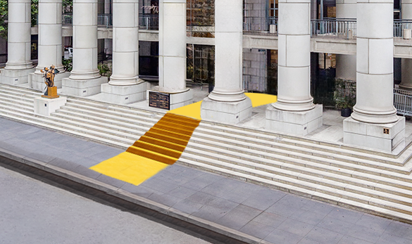
A carpet in Spigit’s yellow cascaded down the building’s grand exterior steps, turning an imposing marble staircase into a welcoming, branded entrance that signaled something different is happening here before anyone reached the door.
One intervention solved several problems at once: temporary and removable, so it met the landmark restrictions; a photograph people wanted to take; unmistakably the brand; and an energetic, optimistic tone set before attendees entered the building.
-
Entrance
The entrance sets the tone for an event. The site had lots of gray: the sky, the sidewalk, and the building’s exterior. The yellow carpet created an undeniable moment of arrival.
-
Main Room & Stage
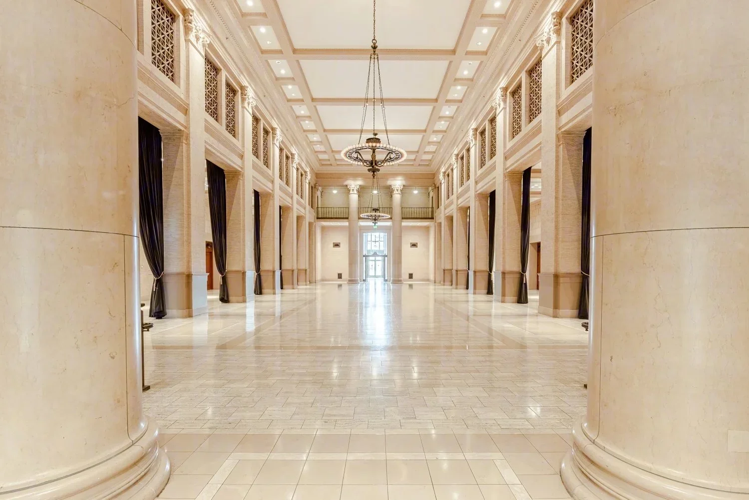
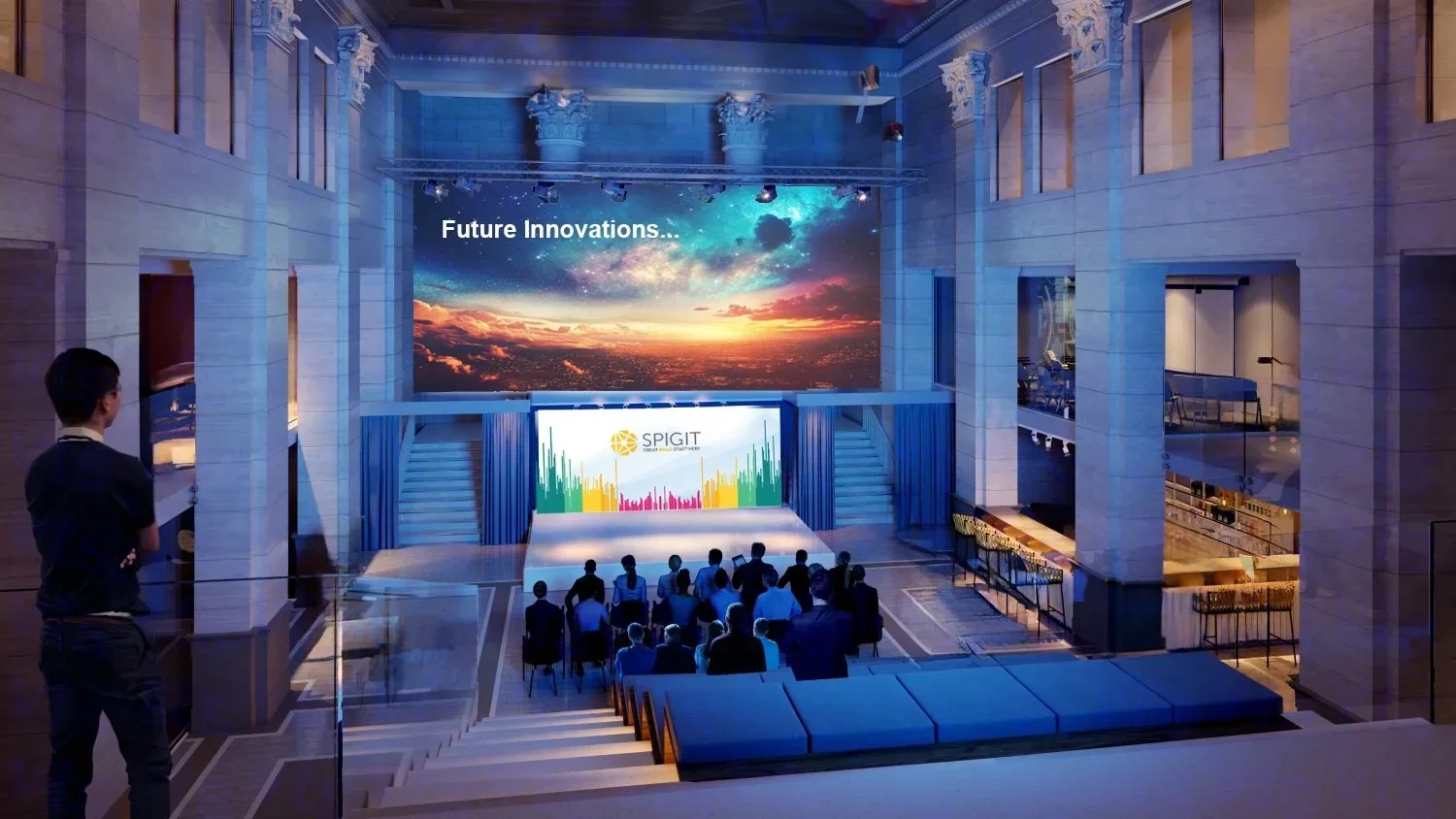
A cavernous Beaux-Arts banking hall — grand, but the wrong proportions for a conference about innovation and far too vast to feel intimate. Rather than laying the room out along its long axis, I turned it onto the short one, built a modern stage against that orientation, and draped much of the ornamental detail. The room became smaller, closer, and more contemporary — without a single thing fixed to a surface.
-
Farallon Room
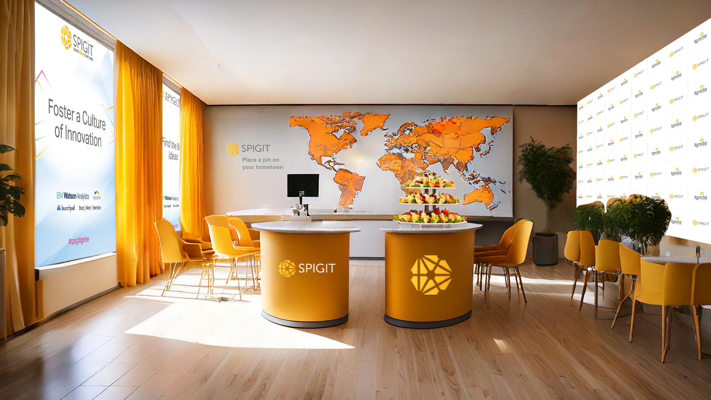
Adjacent to the main room, and nobody wanted to be in it: overhead fluorescents, three large windows admitting no daylight. Strategically we needed exactly this room — somewhere people could meet and mingle over a drink and a bite. I built backlit screens into the windows to stand in for sunlight and brought in rented curtains and furniture in Spigit yellow. Then I added in a stand alone interactive computer exhibit and a pin-your-hometown map, which gave strangers a reason to start talking.
-
Breakout Room
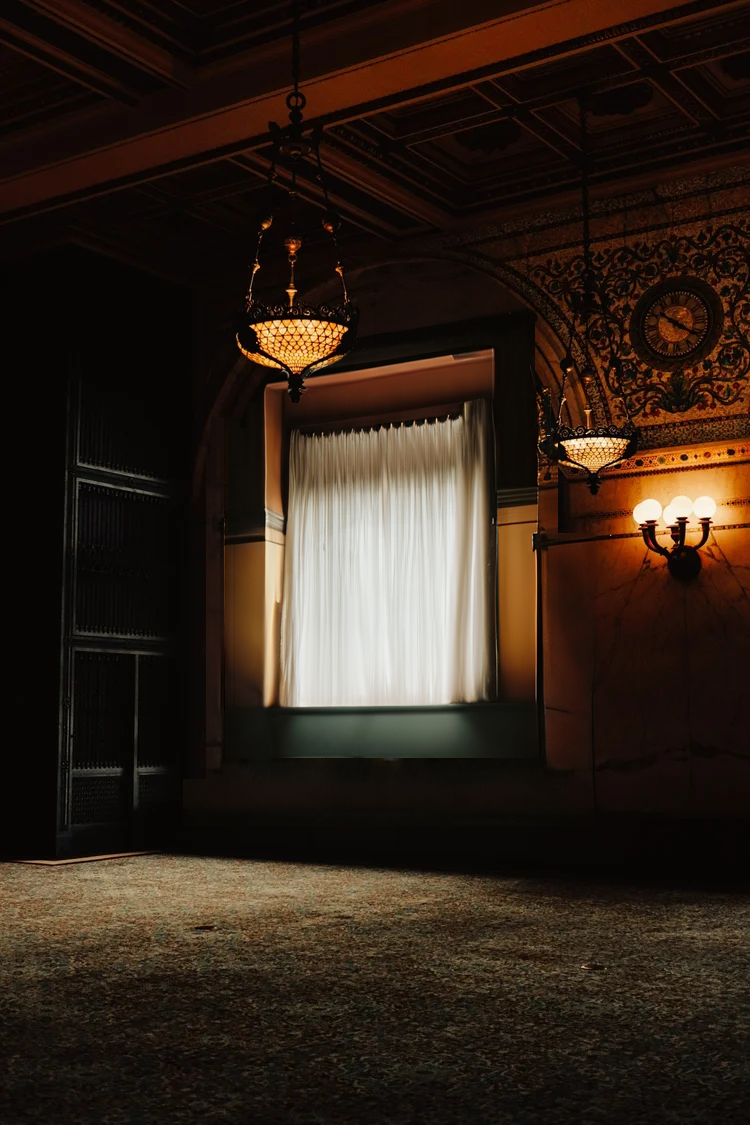
Mid-size rooms off the main hall, where partners, vendors, and experts gave presentations — and where the budget had run out. The windows were barred. I closed the curtains and uplit them in warm light. One move, no money, and the rooms stopped feeling institutional.
The entrance took the budget; the breakout rooms took a light and a curtain rod.
Outcome
The conference closed more business than any Spigit event before it.